A
Alexsevilla
Curioso
Usuário com poucas negociações! Use sempre o saldo do ForoBeta!
Buenas tardes,
Tengo un pequeño problema y creo que es debido al plugin de amazon.
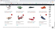
el ultimo párrafo “Barcos baratos” me lo coloca en el borde derecho cuando debería de estar justo abajo de todos los productos.
¿Cómo puedo solucionar eso?
la url es : Barcos Teledirigidos - RcTeledirigidos
Creo que algo me altera el CSS.
Adjunto el código de la plantilla que he utilizado por si cambando algún valor puedo solucionar esto.
Gracias y un saludo.
Inserir CODE, HTML ou PHP:
.aalb-pa-ad-unit {
    position: relative;
    overflow: hidden;
    padding: 22px 40px;
}

.aalb-pa-ad-unit * {
    box-sizing: content-box;
    box-shadow: none;
    font-family: Arial, Helvetica, sans-serif;
    margin: 0;
    outline: 0;
    padding: 0;
}

.aalb-pa-ad-unit.pull-left {
    float: left;
}

.aalb-pa-ad-unit.pull-right {
    float: right;
}

.aalb-pa-ad-unit a {
    box-shadow: none !important;
}

.aalb-pa-ad-unit a:hover {
    color: #c45500;
}

.aalb-pa-product-container {
    width: 205px;
}
/* fixed width and height of product image to 150px */
.aalb-pa-product-image {
    display: table;
    width: 150px;
    height: 150px;
    margin: 0 auto;
    text-align: center;
}

.aalb-pa-product-image-wrapper {
    display: table-cell;
    vertical-align: middle;
}

.aalb-pa-product-image-link {
    position: relative;
    display: inline-block;
    vertical-align: middle;
}

.aalb-pa-product-image-source {
    max-width: 150px;
    max-height: 150px;
    vertical-align: bottom;
}

.aalb-pa-percent-off {
    display: block;
    width: 32px;
    height: 27px;
    padding-top: 5px;
    position: absolute;
    top: -16px;
    right: -16px;
    color: #ffffff;
    font-size: 12px;
    text-align: center;
    -webkit-border-radius: 50%;
    -moz-border-radius: 50%;
    -ms-border-radius: 50%;
    border-radius: 50%;
    background-color: #a50200;
    background-image: -webkit-linear-gradient(top, #cb0400, #a50200);
    background-image: linear-gradient(to bottom, #cb0400, #a50200);
}

.aalb-pa-ad-unit.hide-percent-off-badge .aalb-pa-percent-off {
    display: none;
}

.aalb-pa-product-details {
    display: inline-block;
    max-width: 100%;
    margin-top: 11px;
    text-align: left;
}

.aalb-pa-ad-unit .aalb-pa-product-title a {
    display: block;
    width: 100%;
    overflow: hidden;
    white-space: nowrap;
    text-overflow: ellipsis;
    font-size: 13px;
    color: #111111;
    text-decoration: none;
}

.aalb-pa-ad-unit.no-truncate .aalb-pa-product-title a {
    text-overflow: initial;
    white-space: initial;
}

.aalb-pa-product-offer-price {
    font-size: 13px;
    color: #111111;
}

.aalb-pa-product-offer-price-value {
    color: #AB1700;
    font-weight: bold;
}

.aalb-pa-product-list-price {
    font-size: 13px;
    color: #565656;
}

.aalb-pa-product-list-price-value {
    text-decoration: line-through;
}

.aalb-pa-product-prime-icon .icon-prime-all {
    background: url("https://images-na.ssl-images-amazon.com/images/G/01/AUIClients/AmazonUIBaseCSS-sprite_2x_weblab_AUI_100106_T1-4e9f4ae74b1b576e5f55de370aae7aedaedf390d._V2_.png") no-repeat;
    display: inline-block;
    margin-top: -1px;
    vertical-align: middle;
    background-position: -192px -911px;
    background-size: 560px 938px;
    width: 52px;
    height: 15px;
}

.aalb-pa-product-offer-price,
.aalb-pa-product-list-price,
.aalb-pa-product-prime-icon {
    display: inline-block;
    margin-right: 2px;
}

  [MENTION=16931]medi[/MENTION]a (-webkit-min-device-pixel-ratio: 2), (min-resolution: 192dpi) {
    .aalb-pa-ad-unit .aalb-pa-product-prime-icon .icon-prime-all {
        background: url("https://images-na.ssl-images-amazon.com/images/G/01/AUIClients/AmazonUIBaseCSS-sprite_2x_weblab_AUI_100106_T1-4e9f4ae74b1b576e5f55de370aae7aedaedf390d._V2_.png") no-repeat;
        display: inline-block;
        margin-top: -1px;
        vertical-align: middle;
        background-position: -192px -911px;
        background-size: 560px 938px;
        width: 52px;
        height: 15px;
    }
}

/* css for mobile devices when device width is less than 441px*/
  [MENTION=16931]medi[/MENTION]a  screen and (max-width: 440px) {
    .aalb-pa-ad-unit {
        float: none;
        width: 100%;
    }

    .aalb-pa-product-container {
        margin: 0 auto;
        width: 100%;
    }

    .aalb-pa-product-details {
        text-align: center;
        margin-top: 11px;
    }
}